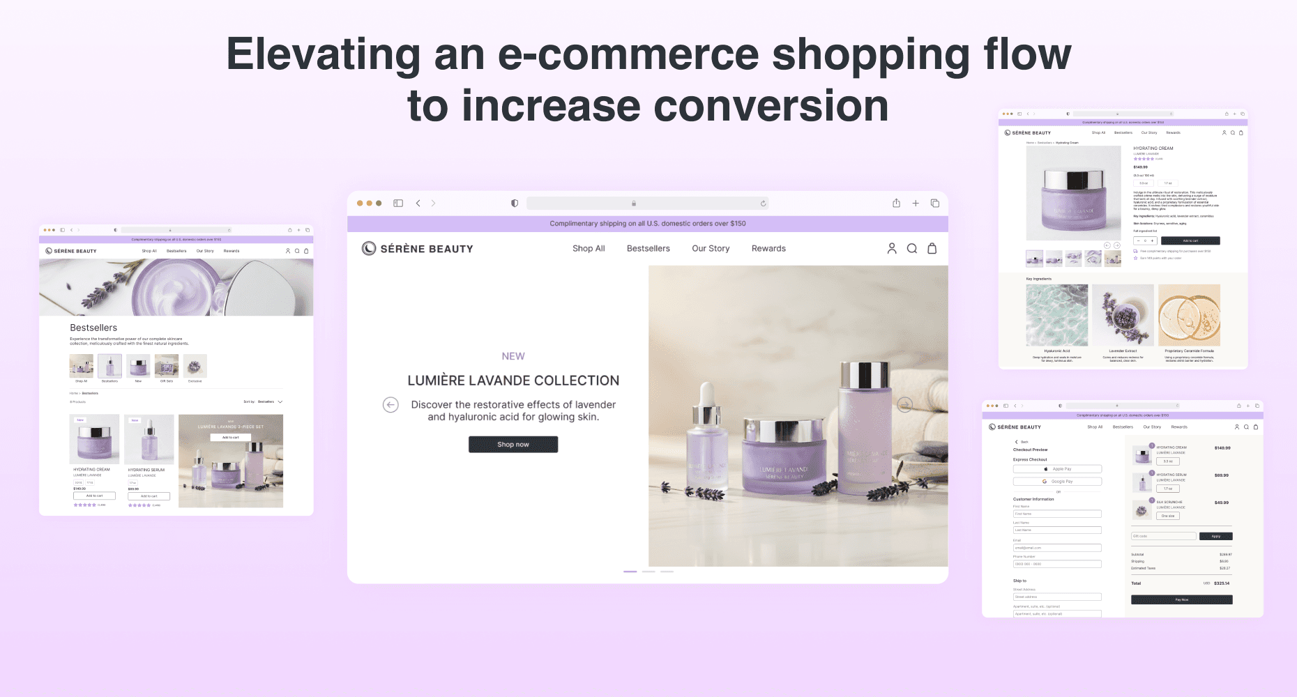
Non-disclosure Agreement: All details and visual designs in this case study have been altered and rebranded to protect the employer’s intellectual property.
Elevating a luxury e-commerce shopping flow to increase conversion.
Mobile Prototype (Updating)


Shop All
Bestsellers
Our Story
Rewards
Complimentary shipping on all U.S. domestic orders
Shop now
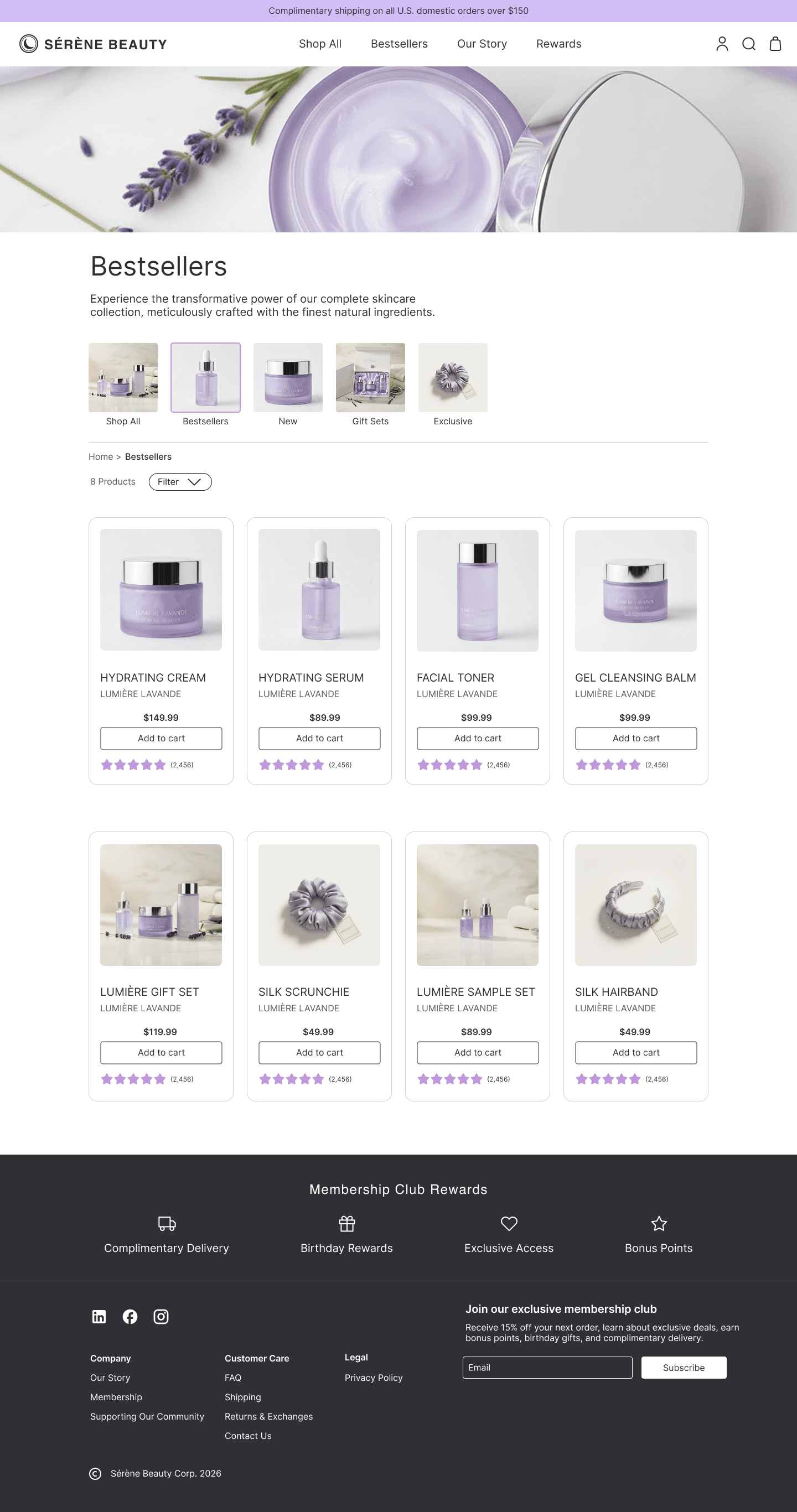
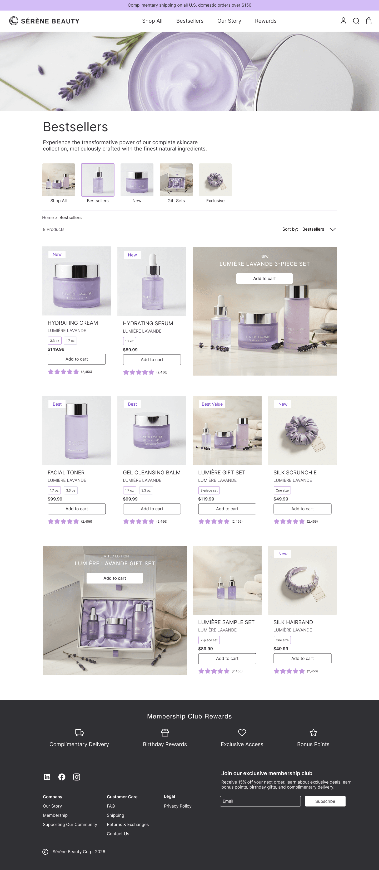
Bestsellers
New
Lunar Collection
New product collection
Exclusive to Sérène Beauty
Curate your Skincare Routine
Gift set with a purchase over $250
Exclusive Membership Rewards
Mission and Values preview
Product Name
Product Name
Product Name
Product Name
Short description
Short description
Short description
Short description
$XXX.XX
$XXX.XX
$XXX.XX
$XXX.XX
Add to cart
Add to cart
Add to cart
Add to cart
Best
Best
Best
Best
(2,456)
(2,456)
(2,456)
(2,456)
Join our exclusive membership club
Lorem ipsum dolor sit amet consectetur. Ultrices risus.
CTA
Customer Care
Legal
Company
Company
Shop All
Bestsellers
Our Story
Rewards
Complimentary shipping on all U.S. domestic orders
Product Name
Product Name
Product Name
Add to cart
Lorem ipsum dolor sit amet consectetur. At.
Product Name
New
Add to cart
Lorem ipsum dolor sit amet consectetur. At.
Gift Set
New
Product Name
Product Name
Product Name
Product Name
Product Name
Short description
Short description
Short description
Short description
Short description
Short description
Short description
Short description
$XXX.XX
$XXX.XX
$XXX.XX
$XXX.XX
$XXX.XX
$XXX.XX
$XXX.XX
$XXX.XX
Add to cart
Add to cart
Add to cart
Add to cart
Add to cart
Add to cart
Add to cart
Add to cart
Best
Best
Best
Best
Best
Best
Best
Best
(2,456)
(2,456)
(2,456)
(2,456)
(2,456)
(2,456)
(2,456)
(2,456)
Join our exclusive membership club
Lorem ipsum dolor sit amet consectetur. Ultrices risus.
CTA
Customer Care
Legal
Company
Company
Sort by:
Bestsellers
Home > Shop All
8 Products
Shop All
Bestsellers
Gift Sets
Exclusive
New
Discover (Story)
Shop All
Bestsellers
Our Story
Rewards
Complimentary shipping on all U.S. domestic orders
Join our exclusive membership club
Lorem ipsum dolor sit amet consectetur. Ultrices risus.
CTA
Customer Care
Legal
Company
Company
Short description
Lorem ipsum dolor sit amet consectetur. Purus sed interdum et lacinia tempus arcu. Vel sodales arcu lobortis faucibus. Feugiat dictum leo adipiscing massa potenti nibh lectus in porttitor. In iaculis leo sagittis senectus proin congue ipsum turpis. Viverra nunc commodo nam auctor massa purus diam. Potenti nisl.
Lorem ipsum dolor sit amet consectetur. Purus sed interdum et lacinia tempus arcu. Vel sodales arcu lobortis faucibus. Feugiat dictum leo adipiscing massa potenti nibh lectus in porttitor. In iaculis leo sagittis senectus proin congue ipsum turpis. Viverra nunc commodo nam auctor massa purus diam. Potenti nisl.
Free complimentary shipping for purchases over $250.
Earn XX points
(X.X oz/ X mL)
$XXX.XX
(2,456)
Benefits
Benefit 1
Benefit 2
Benefit 3
Clinical Results
Ritual Use
Reviews
Step 1
Step 2
Step 3
Lorem ipsum dolor sit amet consectetur. In.
Lorem ipsum dolor sit amet consectetur. In.
Lorem ipsum dolor sit amet consectetur. In.
Lorem ipsum dolor sit amet consectetur. Quam.
Lorem ipsum dolor sit amet consectetur. Quam.
Lorem ipsum dolor sit amet consectetur. Quam.
Based on a clinical trial of 100 women around ages 27-35.
Suggested Ritual Products
Key Ingredients
Shipping
Returns & Exchanges
FAQs
Size
Size
1
Add to cart
Product Name
Product Name
Product Name
Product Name
Short description
Short description
Short description
Short description
$XXX.XX
$XXX.XX
$XXX.XX
$XXX.XX
Add to cart
Add to cart
Add to cart
Add to cart
Best
Best
Best
Best
(2,456)
(2,456)
(2,456)
(2,456)
Based on 2,456 user reviews
Write a review
Sort by: Most relevant
Rating
Lorem ipsum dolor sit amet consectetur. Urna cursus
Lorem ipsum dolor sit amet consectetur. Urna cursus
Lorem ipsum dolor sit amet consectetur. Urna cursus
Verified Review
Verified Review
Lorem ipsum dolor sit amet consectetur. Senectus aliquam in placerat justo quam. Dolor tellus diam ut eu. Et et magna nisi suscipit fringilla nulla. Diam proin nam sit turpis sagittis dictumst in in placerat. Gravida at rhoncus aliquam purus.
Lorem ipsum dolor sit amet consectetur. Senectus aliquam in placerat justo quam. Dolor tellus diam ut eu. Et et magna nisi suscipit fringilla nulla. Diam proin nam sit turpis sagittis dictumst in in placerat. Gravida at rhoncus aliquam purus.
Lorem ipsum dolor sit amet consectetur. Senectus aliquam in placerat justo quam. Dolor tellus diam ut eu. Et et magna nisi suscipit fringilla nulla. Diam proin nam sit turpis sagittis dictumst in in placerat. Gravida at rhoncus aliquam purus.
Name
Name
Name
Date
Date
Date
1 | Viewing 3 of 6 reviews
Shop All
Bestsellers
Our Story
Rewards
Complimentary shipping on all U.S. domestic orders
Checkout Preview
Express Checkout
Customer Information
Ship to
Pay with
Shipping Method
Standard Shipping
$6.90 (estimated delivery around 7-10 days)
$12.90 (estimated delivery around 3-5 days)
Express Shipping
Apple Pay
Google Pay
OR
First Name
Last Name
Email Address
Phone Number
Street Address
Name on Card
Credit Card Number
Apartment, suite, etc. (optional)
City
Expiration Date (MM/YY)
State
Security Code (CVV)
Postal Code
$XXX.XX
Subtotal
$XX.XX
$XX.XX
Shipping
$XX.XX
Estimated Taxes
USD
Total
$XXX.XX
Short description
Product Name
Size
1
$XXX.XX
Short description
Product Name
Size
1
$XXX.XX
Short description
Product Name
Size
1
Apply
Pay Now
Gift card
Back
Shop All
Bestsellers
Our Story
Rewards
Complimentary shipping on all U.S. domestic orders
Order Confirmation
Thank you for your order. Once your order is shipped, you will receive an email with tracking information.
Shipping Information
Shipping Method
Tracking Information
Standard Shipping - $6.90 (estimated delivery within 3-4 days)
First Name Last Name
123 Deer Lane
Los Angeles, CA 91328
$XXX.XX
Subtotal
$XX.XX
$XX.XX
Shipping
$XX.XX
Estimated Taxes
USD
Total
$XXX.XX
Short description
Product Name
Size
1
$XXX.XX
Short description
Product Name
Size
1
$XXX.XX
Short description
Product Name
Size
1
Order Received
On the Way
Delivered

Filter
Sort by:
Bestsellers
Bestsellers
Recently Added
A to Z
Z to A
Latest
A to Z
Z to A
Summary
Recommended for
Benefits +
Ingredients +
How to use +