
Seoul Tea Ordering App
Designing a mobile ordering app that utilizes an intuitive interface for users to simplify pick-up orders.
Role
UX Designer
Timeline
July 2025
Tools
Figma, FigJam, Illustrator
Skills
User Research, User Flow, Journey Map, Competitive Analysis, Usability Testing, Interactive Design, Prototyping
OVERVIEW
Seoul Tea is a tea shop that focuses on classic and blended teas from South Korea. The goal is to create a mobile ordering app with a user-friendly experience that is streamlined to allow for quick changes to the pick-up time.
How can I help create a streamlined interface so users can easily adjust their orders?
THE CHALLENGE
THE SOLUTION
Focusing on a user-friendly interface users can easily understand.
By creating a simplified menu UI tailored for mobile screens, I designed a UI that enables customers to easily view the menu at a glance and make quick changes to their orders.


RESEARCH
Affinity Map
The affinity map contains categorized notes about user sentiments and behaviors about ordering apps from my user interviews.

I wanted to reorganize my findings from my user interviews into an affinity map to gain a clear visual of how users think and feel about ordering tea to-go. There were a couple common themes I discovered after conducting my interviews as well. Many user sentiments were concerned about navigation issues and whether they can easily use the app since they are sometimes busy. They prefer to have it straightforward without getting confused when using the app.
Based on user sentiment, customers prefer mobile ordering apps to be straightforward without complications. There needs to be a balance on the visual presentation for the drinks and it should be simple enough to edit order and pick-up times easily. If the menu is too cluttered and it’s not easy to make changes, users will get frustrated and potentially close the app without completing their order.
Market Research
✔️ Comprehensive features
✔️ Simple pickup/delivery selection
✖ Freezes occasionally

✔️ Built for general POS
✔️ Simple customization
✔️ Minimal layout

✔️ Basic ordering functions
✖ Login crashes
✔️ Rewards program
After examining some popular mobile ordering apps, I noticed there were very similar product card layouts. Minimal designs were also a common element with simple pickup and delivery options. However, there were a few moments when some of the apps would freeze or crash when I was using them.
DESIGN

The user journey map is based on a first-time user logging into the app to order a drink.
After examining where users may potentially add drinks to their order from competitive analysis trends, there were three areas I determined users may consider their order: the menu dashboard, account order history, and suggested drinks. Other than the menu, I made sure to add an order history section for users in case they want to order a previous item as well as in the cart preview page.

When creating the wireframes, I kept in mind how a first-time user flow order would look. I went with a rectangular product card layout for the drinks menu since I wanted to highlight drink name, information and pricing. I thought using rectangular product cards would be effective since this is an app designed for mobile screens and is a trend among current ordering apps. I also wanted to have a search bar in the menu page and eventually added in the pickup selector later on. There were three problems I wanted to focus on when creating the wireframes:
1
Depicting necessary info
for users quickly
2
A quick method to make
pickup changes for orders
3
Intuitive interface any user
can use when navigating menu
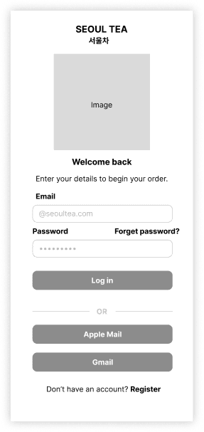
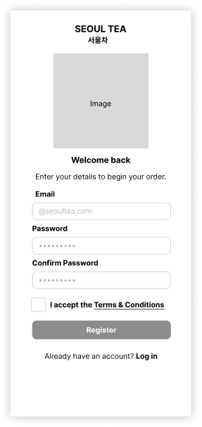
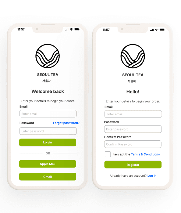
Login & Register Screens
For the login screens, I decided to add in common alternative methods for signing in to give users more options. To clarify users are on the Seoul Tea app, I added in brand details like the name and a logo image.
Menu
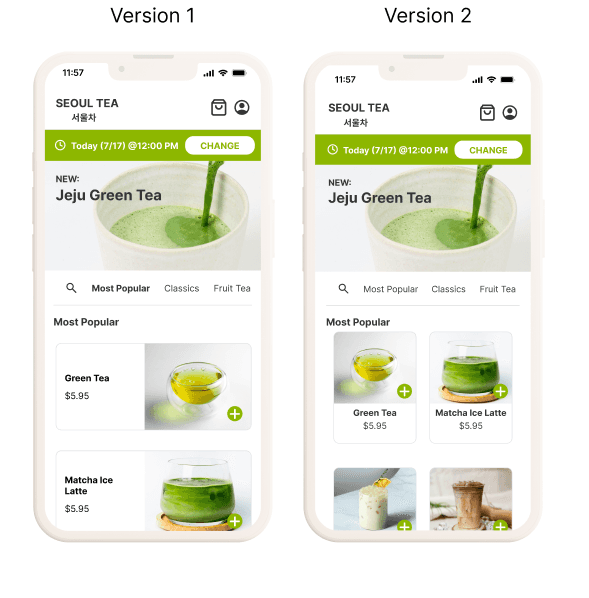
There were two design iterations for the main menu: (1) using a wide length rectangular product card and (2) a narrow rectangular product card. Between the two variations, the narrow rectangular card allowed for more of the drinks to be seen quickly when a user browses the menu. I wanted to get a visual comparison of how the product details would look like between them and see if having short descriptions would be visually appealing. I also added a submenu bar with common tea categories for users to easily search for their preferred drinks.


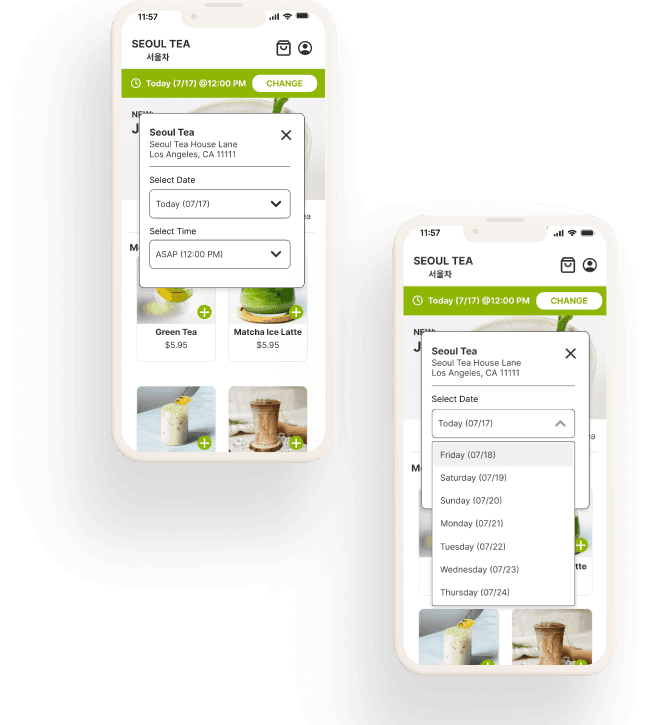
Pickup Selector Pop-up

To ensure users know and see exactly where to adjust the pickup details, I included a bar below the header that is fixed after some feedback. Clicking the change button pops open the information panel for the pickup date and time. I included the shop location as well to make the information clear for the shop’s address for pickup.
KEY DESIGN DECISIONS
Menu
Solution: Condensing the menu navigation bar and layout allows for all the drink options to have more visibility when scrolling. It also brings more emphasis for users to scroll through the menu if they want to order other drink options.
01
After some feedback on the initial lo-fi mock ups, I decided to change the product cards to be vertical rather than horizontal since the short descriptions were not fitting well in the space. I kept the product name and pricing details, but added in a quick add button to streamline ordering process.
02
I also decided to remove the search bar since the layout would look less cluttered and added in a search icon to the submenu bar to quick access to search.
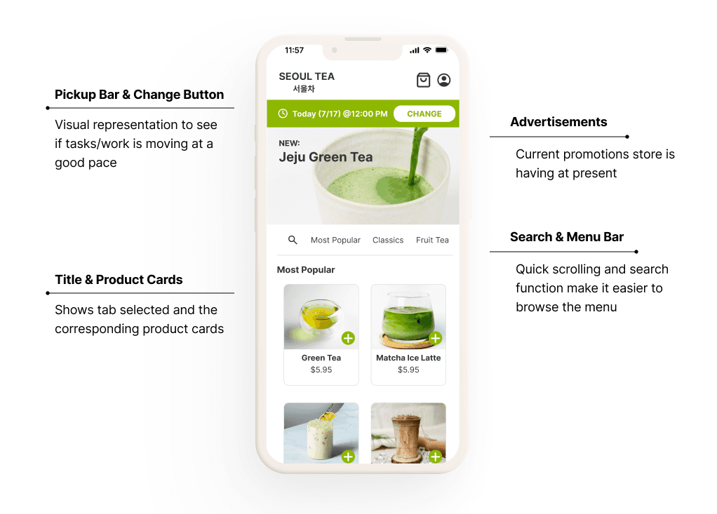
Pickup Bar & Selector
Solution: Although a calendar feature was considered, I went with a dropdown menu for the selector and included the days of the week so it would be easier for users to determine which date they can pick.
With the added functionality of the dropdown menu, users can easily adjust their pickup order date and time.
01
The final mock up for the pickup selector is relatively similar to the lo-fi version, however I added a hover highlight function for the information dropdown menus so users are aware of which selection they make to make it more functional.
02
I also decided to increase the length of the selector box as all the information looked rather condensed and had more readability with added spacing.
Login & Register
Solution: For both the login and register screens, I had the important details in blue rather than green so users can easily spot where they are. Specifically, if they forgot their password or already had an account, they could easily click to switch screen.
Since users would be signing up for the app, I also included a checkbox to ensure they understand that they were making an account.
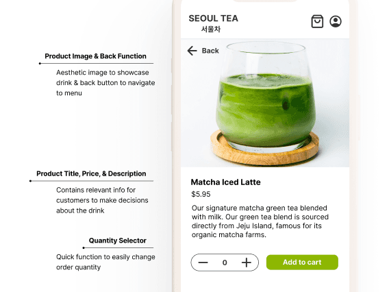
Product Detail
Solution: The product detail page is kept minimal so there’s no excess information for customers. For the drink details, it’s kept short and simple on the type of drink and where the drink is sourced from.
User feedback shows that users like to see an aesthetic picture of the drink they are getting as well as where their tea is being sourced from, so a clear product image and region were included in the details. The quantity selector was also designed to be very minimal and clear when adjusting the quantity.
Design System

The design system for Seoul Tea was created from scratch utizling a simplified UI.
FINAL PROTOTYPE
Bringing all the final designs together.


After building the prototype, there were a few elements that I felt could have been expanded or done differently.
01
Although I focused on creating the pickup selector bar, I felt I could have created a customization feature for the drinks since users mentioned liking that option during interviews.
02
Expanding on the final confirmation page or adding a separate view with better functionality for viewing pick-up order progress.
03
Creating a rewards program to help incentivize return users.
OUTCOMES
In the future, I’d like to revisit this project to add a customization option for the drinks and create a rewards program feature. While I did see users preferred having the option to customize drinks in my interviews, I had some time constraints when I was working on this project, so I decided to consider adding it later since I was focused on streamlining the pickup selection feature. There were a few reasons why I decided to leave it out. I noticed that, unlike bubble tea shops, in my market research, it was a little more complicated to add multiple customization options for various types of tea. However, I believe that by creating a default structure and spending more time, I can eventually add a customization option for every drink.
I also would have liked to add a rewards program as well since it could provide more incentives to continue ordering from the app. There were a few apps I did research on that did have a rewards system, but due to time restrictions I left it out after considering the main goal for this version.
I think the main takeaway was that I could have spent more time expanding on additional features for the app. While I mainly focused on developing a quick and efficient method to adjust pickup times for orders, I realized there were still many features that go into creating a comprehensive features users like having.
Initially, I had some challenges with coming up with the pick-up/change time feature as I normally don’t use delivery or ordering apps. However, after doing market research, I came up with something that feels intuitive, but is very clear. I also had some issues on finding a good balance for the menu item cards since I was not sure how much information to include for the main menu dashboard versus what is shown in the product detail page. Overall, I was also torn between design interface decisions, but ultimately decided to work with a minimal layout.
Thank you so much for reviewing my case study!