
QuickTask B2B App
Created a B2B application that offers task and project management solutions between businesses and their employees to streamline workflow.
Role
UX Designer
July - August 2025
Tools
Figma, FigJam, Illustrator
Skills
User Research, User Personas, User Flow, Journey Map, Visual Design, Competitive Analysis, Information Architecture, User Interface, Prototyping
Overview
QuickTask is a B2B application that offers task management solutions between businesses and their employees. The primary goal is to create a mobile UI that is intuitive for users to efficiently manage projects within the app. By incorporating essential project management features, QuickTask’s mobile UI provides an all-in-one application to streamline workflow management for businesses.
A brief look at two prototypes for QuickTask.


THE CHALLENGE
THE SOLUTION
My solution is to create an intuitive app with features users can use to streamline their workflow. These features would help improve project/task completion to create better work efficiency. The features include:
Improving the navigation between features
An intuitive create function for quick task creation anywhere within the app
Developing a new organization feature for a project/task category
Better information organization for projects
Streamlining direct communication between team members
Research
To gain a better understanding of how to address the main issues, I conducted user interviews and market research to examine.

The affinity map contains notes based on my user interviews
Based on my user insights from my interviews, people tend to get frustrated when there’s a lack of organization in completing their tasks. To tackle this issue, creating better functionality between features and improving communication points can help improve in task completion rates.
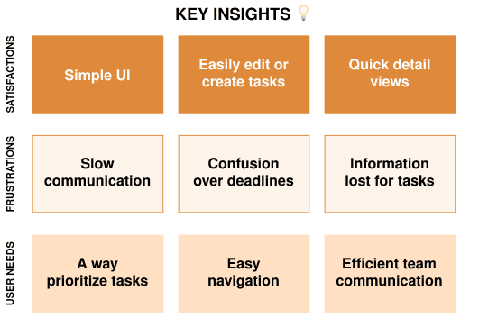
After conducting my user interviews, I’ve discovered users desire methods to efficiently organize tasks and their priorities. In order to be effective, they want to see features where they can have team communication for these tasks. I planned out three core features after these conversations:
01
Develop a messaging system for direct and within projects/tasks
02
Construct a card with prioritization features
03
Create a navigation system between functions


✔️ Comprehensive Task Organization
✔️ Various functions
✖️ Steep learning curve
While examining the current market’s leading project/task management apps, I discovered many common features. However, though various functions assist with project management, there is a noticeable learning curve when first using the apps due to the large amount of features. I hope to tackle this issue by condensing the features to the essential functions while developing an intuitive design.
To gain a better understanding of what both employees and project managers would need to create a seamless user experience, I explored some user personas to assist in formulating some designs. These insights explore experiences and goals users may encounter when utilizing the app.


Ideation
While outlining each feature’s connectivity, I created an overall user flow for visual clarity.

An overview of where all functions navigate to within the app

The user journey map is based on a first-time users flow to create a new task.

When I began wireframing the app designs, I kept in mind the market trends for project management. These features include some form of:
A schedule
Daily tasks
Create functions
Project overviews
Messaging features
Main dashboard
Navigation menu
There were various functions I created for the app, however, I’ll be focusing on the main features that users would use that leads up to a new task creation.
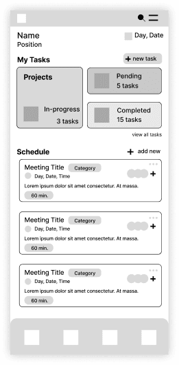
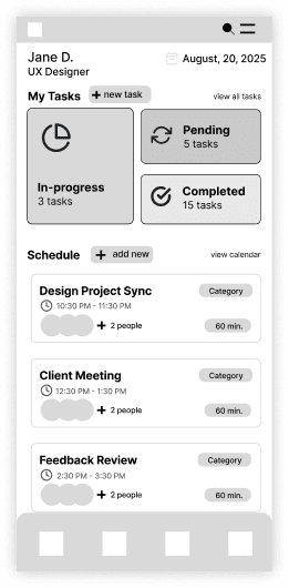
In the dashboard, I included a footer menu so there will be easier access to all primary features within the app. When going through my iterations, I ended up with a mix of version 1 and version 2 after making adjustments to the card layout and button locations. After feedback, I made layout adjustments to the meeting cards to make the category and time easier to find. The meeting title was also made larger with a heavier font weight for better readability.
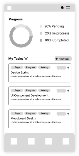
To present a visual of the tasks completed, I created a chart with an index so users will have a better idea of how much work they need to do and what they should focus on. Similar to the meeting cards in the dashboard, I played around with some ideas of how to create a better visual guide. Ultimately, I used version 3 since it had a similar look to the dashboard cards, which could help users process as it was familiar visually.
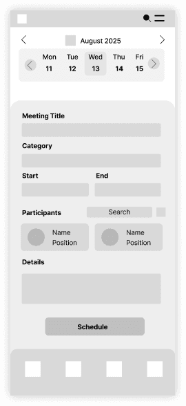
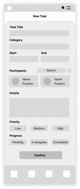
When devising the create functions, I went through a few different variations for projects, meetings, and tasks. I experimented with adding a mini calendar at the top; however, it was repetitive when the date input field also provided a pop-up calendar for scheduling. The design I went with for the create features was similar to the task iteration, but has minor adjustments to include a priority and category grid.

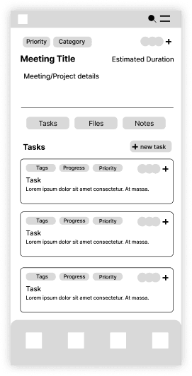
As I was creating the meeting/task variations, I decided to add a section menu to separate different functions within the task: team members, files, notes, and tasks. Organizing all the information within the meeting/tasks with the different sections made relevant information accessible for all members. I also arranged the tags towards the top of the page so they could be easily referenced, similar to how they appear as cards in the dashboard.
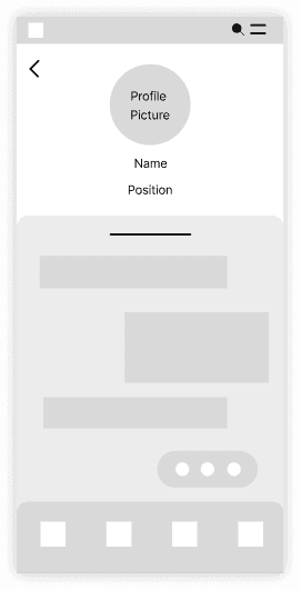

After reviewing my market research, I designed the message dashboard to be similar to other messaging software so users will have an easier time navigating through channels. The message log I came up with had combined design elements of a profile and direct messaging. However, after some feedback that it felt too similar to personal messages rather than being in a corporate setting, I changed its layout for the final mock-up.
Key Design Decisions
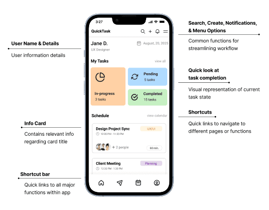
For the main dashboard, I focused on highlighting all available features within the app from the header to the footer.
I decided the footer menu should contain shortcuts for all the main functions of the app. Utilizing the footer will reduce the confusion for switching between the app’s features. Specifically, I focused on including the key features in the footer to simplify how all the information is organized between the features.
The messaging feature is also included to create a quick method to access any communication between members. Combining these elements creates seamless navigation within the app.
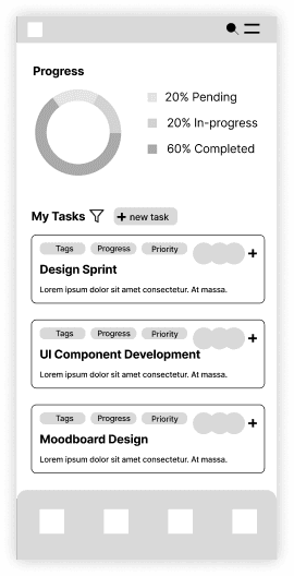
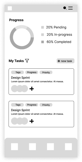
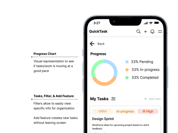
The primary feature for the My Tasks page is the progress chart, which highlights how the workflow is moving.
I made some minor adjustments to the filter and adjusted the add new button as a shortcut to start creating tasks.
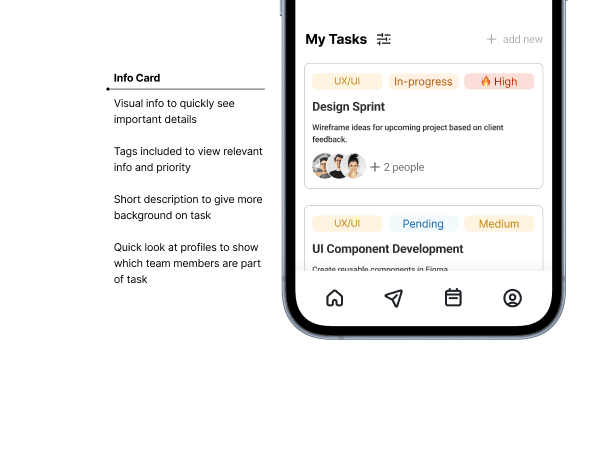
Within the info cards, I considered keeping the tags in grayscale. However, after reviewing my research, I decided to make only the tags have colors so users can recognize their categories at a glance.
I included short descriptions for the task info cards because I felt they could give more information about the task.
01
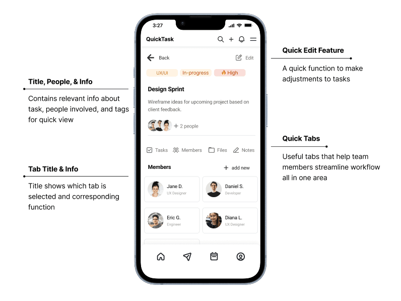
In the previous lo-fi mock up, I received feedback on whether there was a method to edit existing tasks, so I created a new edit feature in the top corner of the page so users can easily edit the information within the existing task.
02
Within the section tabs, I added a notes section where new notes can easily be added within the page instead of navigating to a new creation page. This would allow for quick comments within the task itself.
By combining the layout, section menu, and additional features within the page, I created a seamless interface that contains relevant information that all team members have access to, but is still intuitive.
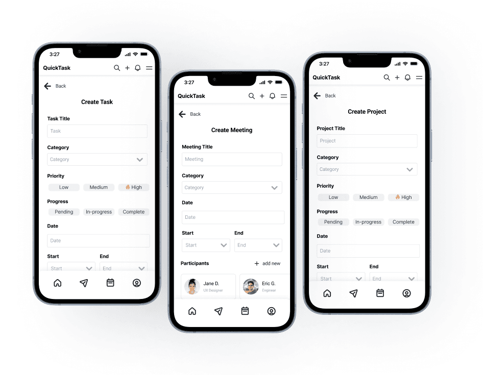
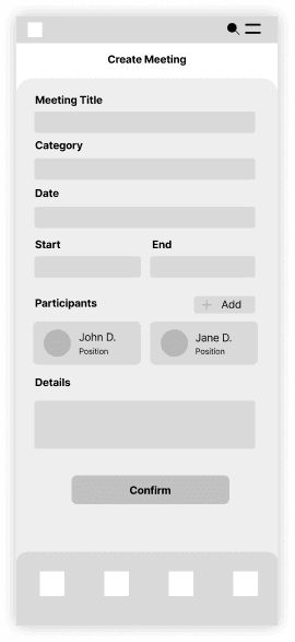
After receiving some feedback, I eventually combined the designs to all have similar layouts with minor adjustments so users can easily navigate the input fields whether they’re creating tasks, meetings, or projects. While the create meetings function does not include a priority grid, it is visually similar to the other create functions, so it will be similar enough for users to navigate.
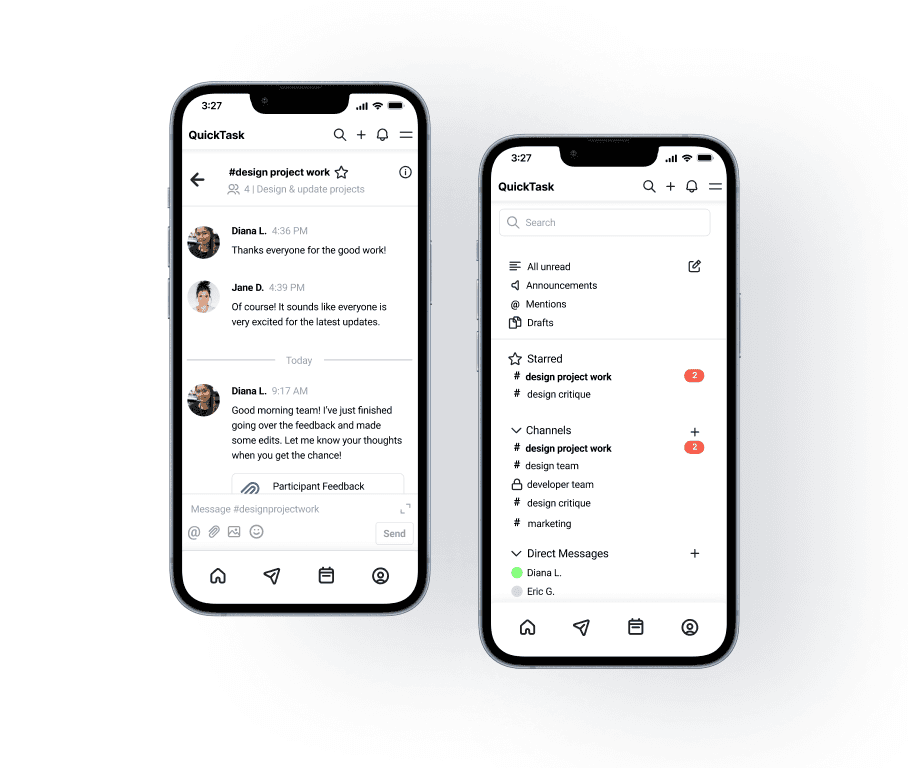
In the message log, I made some adjustments to include additional details at the top of the screen with a brief description to help clarify what the messages were about.
I also added in some features within the message input box so users can add files, mention each other, or emojis. There is also an expanded message option, so it’s easier to type out responses and it serves better for usability on mobile screens.
Design System

For the QuickTask app, I created the design system from scratch.
When constructing the design system, I decided to keep the typography to a minimum since it is a mobile app. However, I did compile various colors that were used to make the categorization tags.
Components

A visual guide to various components I built when designing the app.
Final Prototypes
Overall, the final prototype ended up having more features than I initially planned out. As I received feedback on the lo-fi mock-ups, I added functionalities to improve the prototype's usability.


01
There were some issues when using the quick create function in the header and changing between pages within the hamburger menu, as it would not automatically close the header variant.
02
A minor layout problem when switching between the different section tabs within the tasks was also found. However, I think this has to do with it shifting the entire screen back to the top of the screen when moving between the different tab screens.
Takeaways
Results
QuickTask’s mobile app design resulted in an intuitive UI that offers various solutions for efficient project and task management.
Potential successes for the design are the completion rates of tasks due to seamless communication within the app. The task completion rate is impacted by whether users can organize their tasks and communicate with each other within the app to finish the task. With the UI design, they can easily create, edit, and review their tasks across the various features to ensure they can complete projects.
What’s next for QuickTask?
In the future, I’d like to add more features within the schedule screen and expand on the messaging functions. While I created a simple schedule interface that focuses on daily schedules, I would like to be able to create visual reminders within the calendar.
I’d also like to create a desktop version of the app. With the main features hashed out, I think it could translate well into a desktop version and potentially include additional features that may have been limited when using mobile devices.
Takeaways
It was difficult to find the right balance between adding and removing details for the UI since I had to determine which elements were necessary. While I think I could have added more functions, I thought it was challenging to do so without cluttering the interface, especially on a mobile device.
When designing the create functions, it was challenging to create three separate variations while keeping the interfaces similar so users do not get confused about how to use three different create functions.
In the future, I’d like to be able to add to the functionality of the app with additional functions that could benefit users, but still maintain a balance in design.